Questions about the brand?
We're here to help you represent commercetools accurately
Reach out to our Design and Strategic Communications teams for approvals, asset requests, or usage questions.


How to represent commercetools accurately and consistently: brand narrative, voice and tone, logo, color palette, illustration, icons, photography, graphic language, and typography.

The commercetools brand is rooted in a clear sense of purpose and possibility. We're a trusted partner for innovation, built to help businesses continuously succeed in a world that never stands still. The statements below are foundational to how we show up in the market and how others should talk about us.
| Mission | Shape a world of commerce with limitless possibility |
| Vision | To be the architects of commerce innovation |
| Purpose | Deliver commerce solutions for today, built to adapt for tomorrow |
| Brand Promise | Be your trusted partner for commerce innovation |
| Attributes | Visionary. Agile. Dependable. |
| Positioning | The most versatile solution for enterprise commerce innovation |
commercetools is the most versatile solution for unmatched commerce innovation. Unlike rigid alternatives, our open platform gives enterprises the freedom to adapt, innovate, and sell their way - transforming market changes into business growth.
In a world that never slows down, commerce is at a crossroads. The way we buy and sell has changed forever. Customers now expect businesses to meet them anywhere, anytime, seamlessly integrated into their daily lives. With every interaction, the rules are being rewritten. What was once a simple transaction is now a dynamic exchange of value that builds loyalty and drives growth.
Yet while commerce speeds ahead, too many businesses remain stuck, tethered to rigid, legacy systems that stifle innovation. When customer expectations outpace your technology, the stakes couldn't be higher. One poor experience is all it takes to lose them for good. To keep up, you must be willing to adapt.
We believe there's a better way. Imagine a world where your commerce platform doesn't limit you but sets you free. A world where you can move faster than your customers change. Every touchpoint is a meaningful experience. Every interaction fuels connection. In this better world commerce innovation knows no limits.
commercetools makes this future possible. The most versatile platform for commerce innovation, commercetools gives you the freedom to adapt, innovate, and sell your way - turning market shifts into growth opportunities. The future of commerce belongs to those who are ready for it.
We're shaping a world of commerce with limitless possibility.
Commerce has changed. And legacy tech just can't keep up. That's why the world's most innovative brands choose commercetools to move faster, break barriers, and grow without limits. Because the future of commerce belongs to those who are ready for it.
For global enterprises, commercetools provides the leading AI-first digital commerce platform, delivering unmatched revenue growth and performance. Our modular, scalable technology is the foundation for innovation - from agentic commerce to conversational experiences - giving businesses the flexibility to respond to changing business needs fast and with confidence.
By removing the constraints of legacy systems, commercetools enables enterprises to realize new opportunities faster, meet the evolving demands of their customers, and expand across offline and online channels, regions, brands and business models without compromise.
To learn more, visit commercetools.com.
Media Contact: comms@commercetools.com
commercetools blends the visionary mindset of a creator with the curiosity and adaptability of an explorer. We call this combination The Agile Architect.
This archetype shapes how we speak, act, and appear from our product thinking to our storytelling. It reflects our ability to bring structure to complexity, while leaving room for freedom, imagination, and growth. We don't just respond to change - we build for it.
We're trusted partners who help others navigate uncertainty, unlock innovation, and move fast without breaking things. Our tone is confident but approachable, inspiring but grounded, always focused on what matters most: helping businesses move forward on their terms.
Visionary. Agile. Dependable.
We anticipate what's next, then help others build for it.
We're open, flexible, and willing to challenge assumptions.
We turn bold ideas into practical outcomes.
By understanding this archetype, you'll better capture the spirit of commercetools in your own work whether you're writing about us, collaborating with us, or representing us visually.
Our voice reflects who we are. That is visionary, agile, and dependable. It's how we express our personality and values whether we're speaking on stage, appearing in the press, or being featured in a partner's campaign. commercetools speaks with clarity, confidence, and purpose. We balance imagination with precision, and always center the customer instead of ourselves.
We speak with authority - but never arrogance. We avoid buzzwords and filler. We explain complex ideas in simple, human terms.
Our tone is energetic, not overhyped. Even when we're talking about technical innovation, we stay grounded in the real-world impact.
We tell stories that spotlight progress, potential, and possibility, but we always back it up with substance. If it sounds too good to be true, it probably needs revising.
Use active voice and everyday language
Keep it concise with short sentences, short paragraphs
Prioritize clarity over cleverness
Avoid marketing cliches like "seamless," "empower," "best-in-class," or "disrupt"
Refer to commercetools in lowercase (always one word)
When in doubt, focus on what the customer gains
When you're writing about commercetools, imagine you're introducing a future-ready partner, one who's quietly shaping the industry, not shouting about it.
We're not the loudest in the room. We're the ones building what's next.
Our symbol locks-up with our logotype. The logotype is based on the typeface PP Right Grotesk, and it contains bespoke modifications to certain letterforms. These are designed to make the logotype more compact, so that it can be used at larger sizes and have more presence in our communications - as well as making it unique to commercetools.
The relationship between the two elements has been precisely defined, and you should not attempt to recreate it. Please only use the approved locked-up assets when reproducing our symbol and logotype in combination.
This is our unique symbol. It is formed from the planes of an open cube, drawn with pure isometric geometry, which combine to create an abstracted 'C'. The way that these planes come together reflects the core concept of commercetools - that of endlessly adaptable 'composable commerce'.
A special version of our logotype has been created specifically to reverse-out of darker colours whilst maintaining its impact and strength.
A vertical locked-up version of our logo has also been created, to be used when this arrangement suits the format better than using the horizontal logotype.
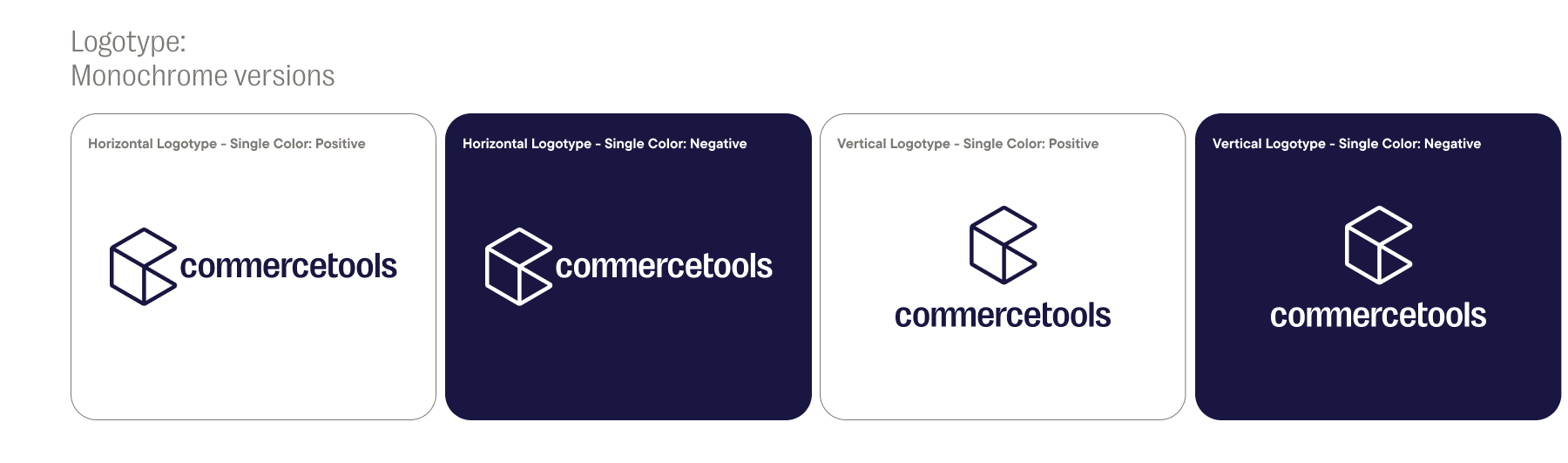
Single color versions (monochrome) of our logotypes are also available, for use in these permitted colourways. They should be used in instances where a full color logotype would not be legible - over imagery for example - or where color use is limited.
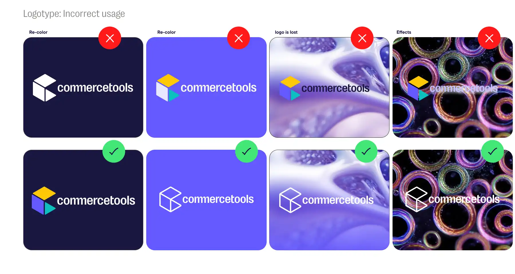
The commercetools logo should never be altered in any manner, including modifying the official colours, or the order of the colours. Never recreate the logo including AI. The logo should be visible at all times so maintain sufficient contrast with the background placement.
Don't alter the colours
Don't apply effects
Don't stretch or turn the commercetools logo
Do not apply special effects such as drop shadows
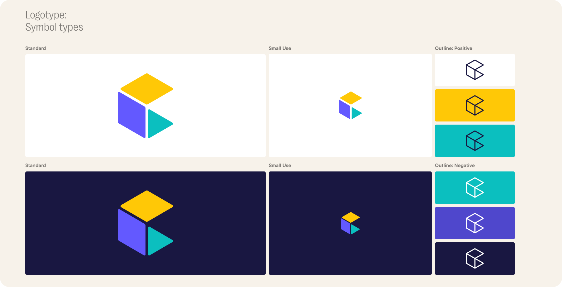
Our symbol is available to use in various formats.
The full color versions have been designed to work on light backgrounds, as well as on our dark CT Plum colour.
When the symbol needs to be used at smaller sizes, we have a special Small Use version.
Single colour versions of our symbol are also available for use in the permitted colorways illustrated below. Please do not use this symbol in any other colorways.
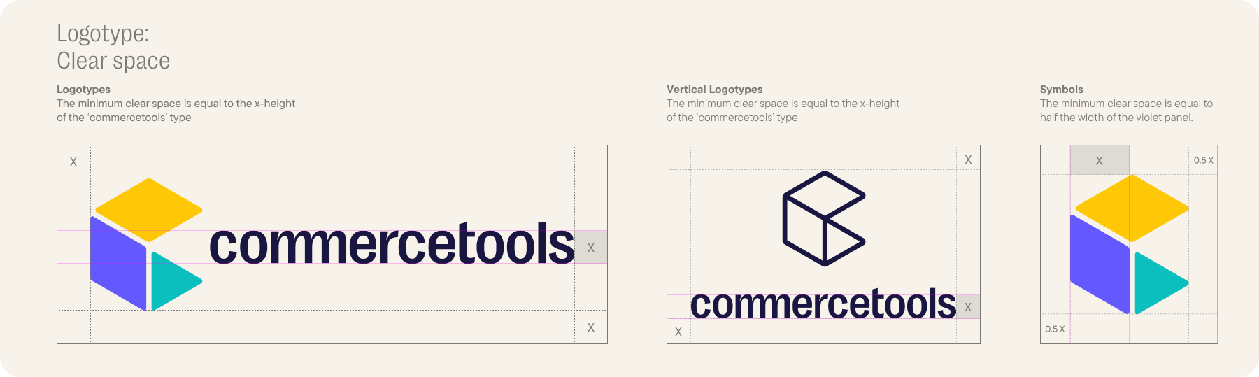
We always want our symbol and logotype to stand out and be clearly legible, so we have devised specific guidance on the minimum amount of clear space to use. These guides are only for the minimum space, but please allow as much clear space as possible wherever you can.
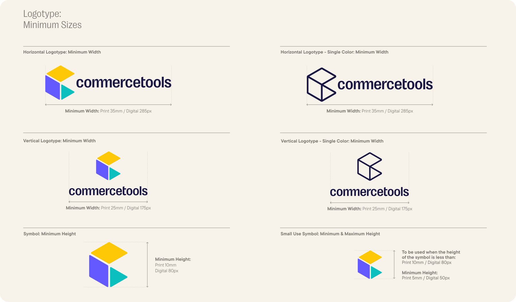
We prioritize the legibility of our symbol and logotype, adhering to precise measurements that define the minimum sizes for their optimal use. While the Small Use Symbol is subject to a specified maximum size, all other iterations of our logotype and symbol are unrestricted in size, allowing for bold and impactful presentations.
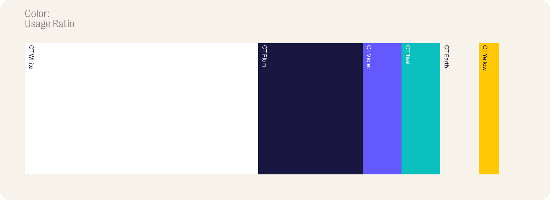
The colors that form the basis of our identity have been chosen to reflect the vibrant essence of our brand.
The foundation of our identity lies in our primary color palette, embodying the vibrant essence of our brand. White plays a crucial role in our identity, imparting a sense of cleanliness, freshness, and modernity to our brand.
ct Violet
#6359FF
rgb(99,89,255)
C67 M69 Y0 K0
ct Teal
#0BBFBF
rgb(11,191,191)
C71 M0 Y32 K0
ct Yellow
#FFC806
rgb(255,200,6)
C0 M16 Y90 K0
ct Plum
#191741
rgb(25,23,65)
C94 M97 Y10 K52
ct Earth
#F7F2EA
rgb(247,242,234)
C4 M4 Y10 K0
All hyperlinks use the color #2667D2.
CT Violet: #C2C2FF, #8F8FFF, #7676FF, #6359FF (base), #4E4ED8, #4242B2
CT Teal: #9FF7EE, #29EDE3, #0FDBD1, #0BBFBF (base), #0BADA8, #0A948F, #097F79
CT Yellow: #FFE9A1, #FFDC6E, #FFD03B, #FFC806 (base), #FFB000, #FF8B00
CT Earth: #FBF9F5, #F7F2EA (base), #DEDAD4, #C6C2BC, #94918C, #7C7975
CT Plum: #7979D1, #4F4F99, #252566, #191741 (base)
CT Violet: Quality
In the world of quality, we aim for unmatched excellence. Every creation reflects exceptional quality and a steadfast commitment to high standards, defining our pursuit for greatness.
CT Teal: Growth
Teal embodies the harmony of nature, growth, and tranquility. It mirrors a refreshing balance, nurturing creativity and fostering an environment where innovation thrives.
CT Yellow: Energy
Yellow symbolizes a burst of bright, dynamic energy - where our enthusiasm, positivity, and trustworthiness unite, fueling a vibrant and uplifting spirit throughout our endeavors.
CT Plum: Leadership
Plum exudes a touch of class and elegance, symbolizing strength, sophistication, and leadership. It's a hue that commands respect and speaks volumes about our forward-thinking vision.
CT Earth: Reliability
Rooted in reliability, the earthy tones embody stability, dependability, and a deep kinship with nature. They infuse comfort and trust into every facet of our creations.
Simple. Clean. Accessible.
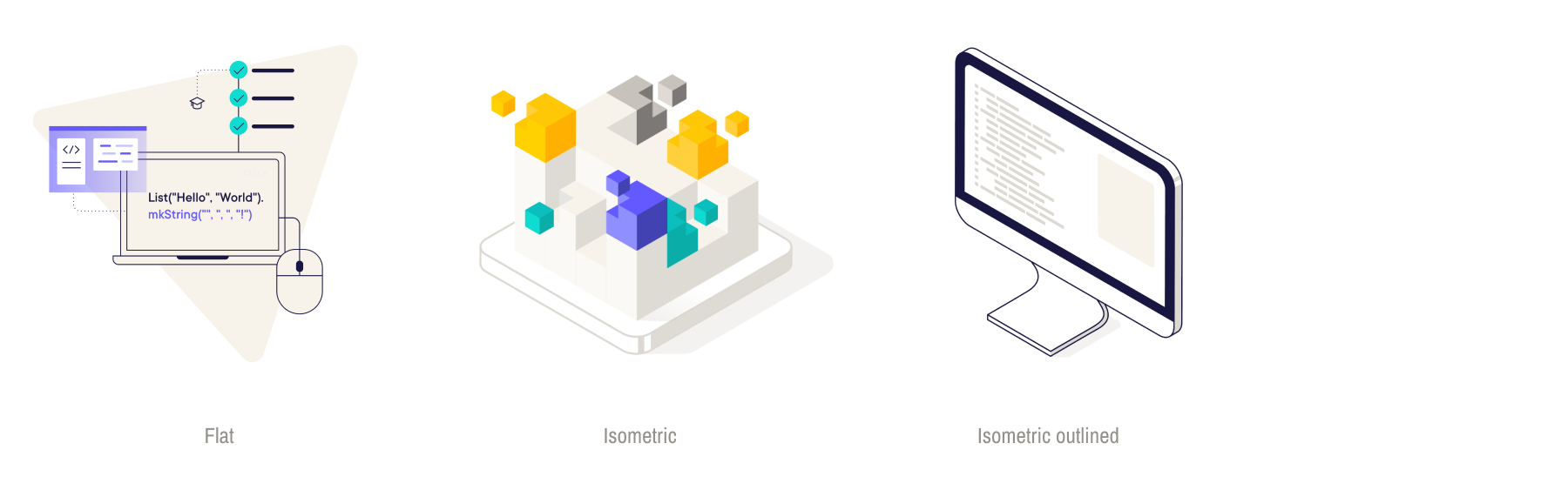
We believe in making the complex beautifully simple. The role of our illustrations is to help translate tech language into an appealing visual story. Our palette of illustration styles is a toolbox to help you articulate the intricate in a way that's engaging and informative.
The diverse array of illustration styles is here to provide ample options for effectively communicating specific concepts and ideas to varied audiences across different channels. This variety ensures adaptability to diverse preferences and contexts.
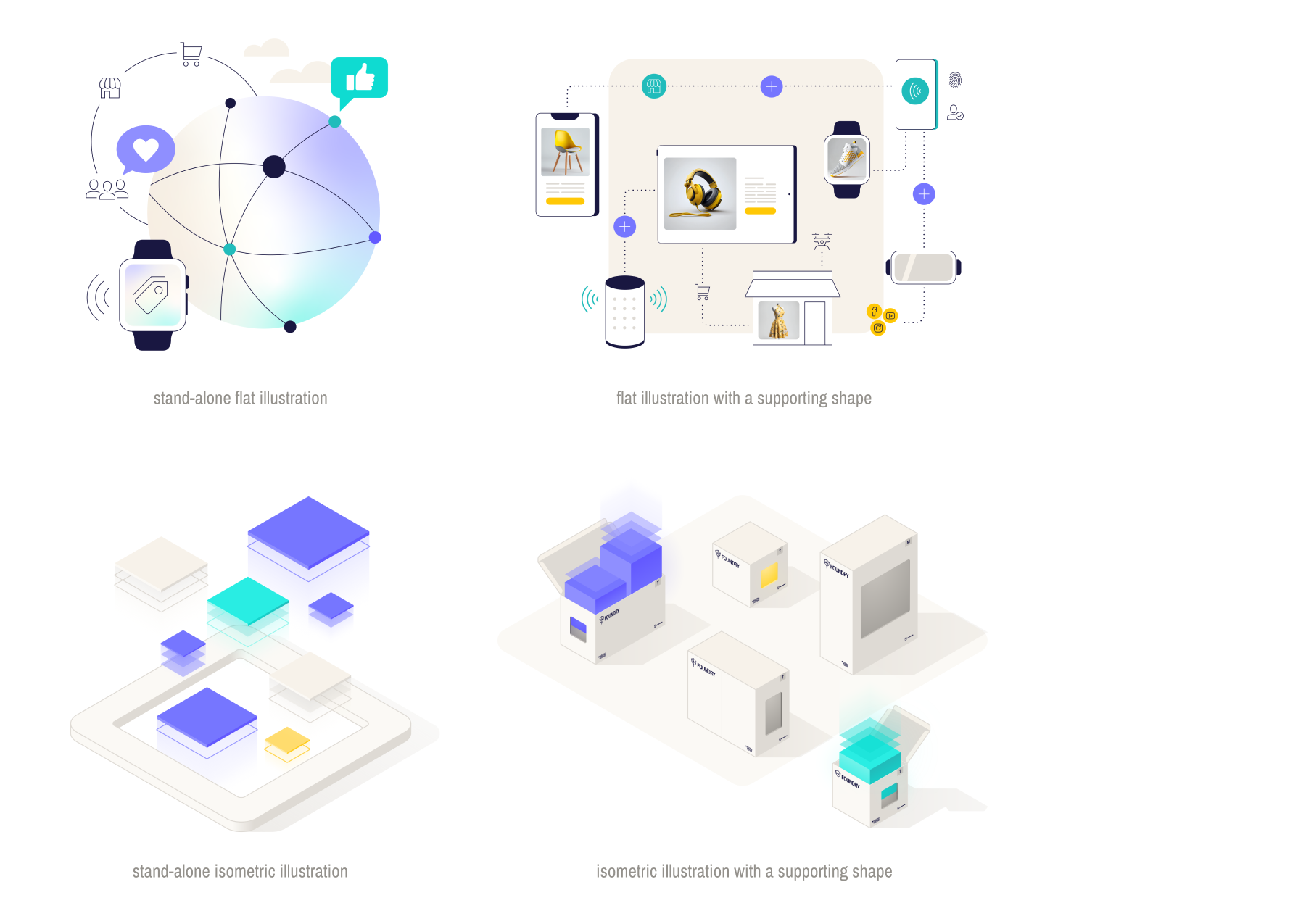
The flat illustration style is ideal for situations where the visual element harmonizes with the information, rather than overpowering it as the primary visual focus. Conversely, the isometric illustration style is instrumental in enhancing accessibility by offering invaluable assistance in simplifying complex concepts.
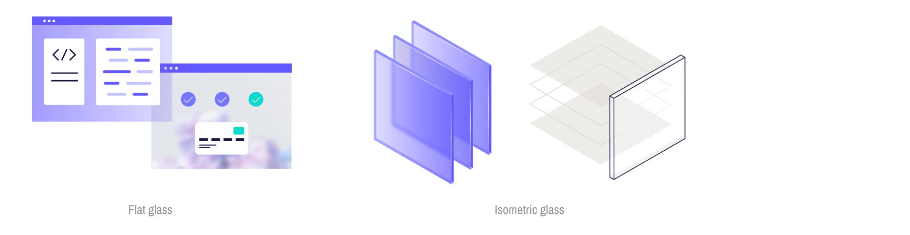
The glass effect serves as a complementary element when paired with an illustration or placed atop a photograph. Its purpose is to elevate and draw attention to specific aspects of the visual. Whether taking center stage or playing a supporting role, it serves as a versatile element within a composition.

1. Apply a stroke of 3px on a 2000x2000px canvas, ensuring proportional scaling of the stroke relative to the canvas size.
2. Objects that play a key role in composition and are filled with color feature strokes matching the darkest color applied to them.
3. Strokes may be omitted for objects with supporting roles, or those featuring a glass effect or transparency.
4. A dotted line of 6px can be used to show a connection between elements within a composition.
5. The shadow is a gradient of #dedad4 at a 50% opacity.
6. The subtle glow can vary in color and opacity, depending on its purpose within the composition.
All colors utilized in the illustration must adhere strictly to the brand's overarching guidelines. It is advised to closely adhere to prescribed color ratios and to avoid excessive color diversity within compositions. Additionally, ensure that multiple primary colors do not dominate and compete against each other.
When applying color to backgrounds, strive for a significant contrast between the background and the illustration. Avoid overly dark tones that may overpower the artwork or hues diverging from your primary color choice.

Our recommended background colors are: White #FFFFFF, Earth +1 #FBF9F5, Earth #F7F2EA, Violet +3 #C2C2FF.
A background shape, such as the tilted triangle, rounded square, or diamond shape, can effectively serve as a supporting element within a composition. Please adhere to the specific usage guidelines outlined above.
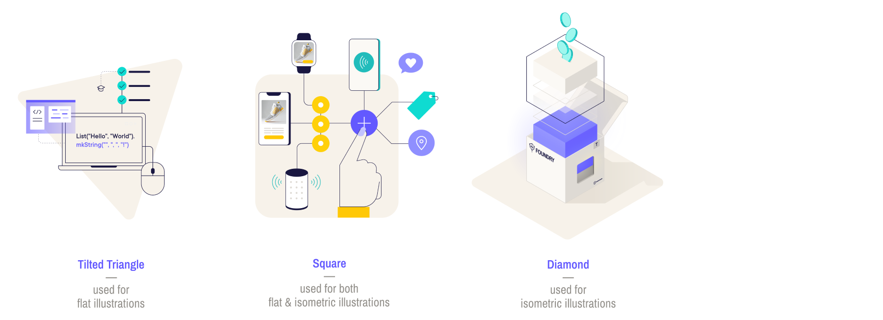
Below are some examples that can serve as inspiration or guidance for anyone working on creating new illustrations that align with our brand.
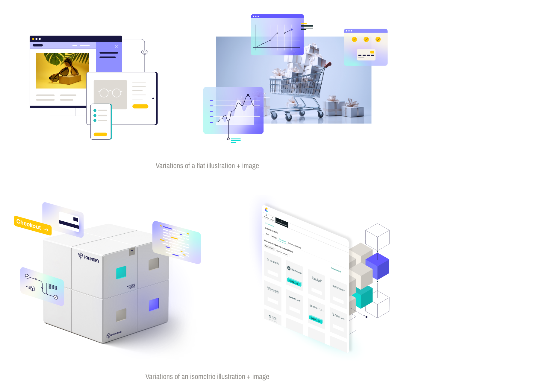
In addition to a final visual comprised solely of an illustration, there's the option to integrate an image into your illustration or overlay illustrations onto a photograph.
commercetools icons are found across a diverse range of contexts, spanning web interfaces, presentations, whitepapers, and advertisements. That's the reason it is crucial to meticulously meet the design considerations associated with each icon to uphold a sense of coherence and cohesion within the system.
Key factors to be mindful of include line width, corner roundness, and color.

How to create an icon?
First of all, we recommend creating the icons in Illustrator. Once they're approved, add them to the master file (more on this later). We need the canvas size of 512x512px so we can export it with a 'safe area' included. The grid size in which the icon mustn't go out is 384.5x384.5px.

Once you have your document set up, you can start designing the icon. Remember that keeping it simple and 'iconic' goes a long way. The width for the lines must be 8pt. The corner roundness is set to 20px; but if the shape ends up looking too round, it should decrease to 10px.
In this example, the small columns chart should be 10px otherwise they will look strange. This aspect is sometimes better to do it by 'eye' and then comparing it to the rest of the icons to keep consistency.

The outlines of the icon are always ct-Plum, that's something we shouldn't change. When using colors on commercetools icons, we must keep in mind that only two colors are available for its use: ct-Violet and ct-Teal. Use these colors to highlight important aspects of the icon as well as to separate the elements within its design. Try to keep it balanced!
Don't overuse color on the icon, it will look too busy and won't be as impactful as intended.

Within this icon system, different iterations of each asset have been developed. We have crafted three distinct options to cater to the necessity the design or application requires. When observing an icon, keep in mind that you also have the same version presented in three distinctive styles:
Full-color icon
Outlined in Plum color
Outlined in Earth color
This variation ensures adaptability and allows for seamless integration into a high variety of visual contexts.
Note: We export each icon both in .PNG and .SVG formats to simplify its use on different platforms.

In combination with the Presentation Icons we also have the Monochromatic Icons, a completely different system which is used mostly for web design, whitepapers and illustrations. They're outlined icons in ct-Plum, and don't contain coloured parts. They tend to be simpler than the presentation icons and are used to signal important key elements, depending on the context.

Always keep in mind that the icon system is comprised of a set of rules that must be respected. Ensuring the provided colors are in check, as well as the line's width, is of vital importance. Additionally, avoid deforming the logo when placing or scaling it.

Our photographic art direction style that features people is bright, with natural light. Using focus, depth of field and shooting through glass and between subjects and objects, we suggest layers and transparency - which ties into our 3D glass visual language.
Please note that the images featured here are for illustrative purposes only, and have not been licensed for use by commercetools.

Our product imagery should exist within a clean, white space - and be beautifully lit with clean, bright light.
Please note that the images featured here are for illustrative purposes only, and have not been licensed for use by commercetools.

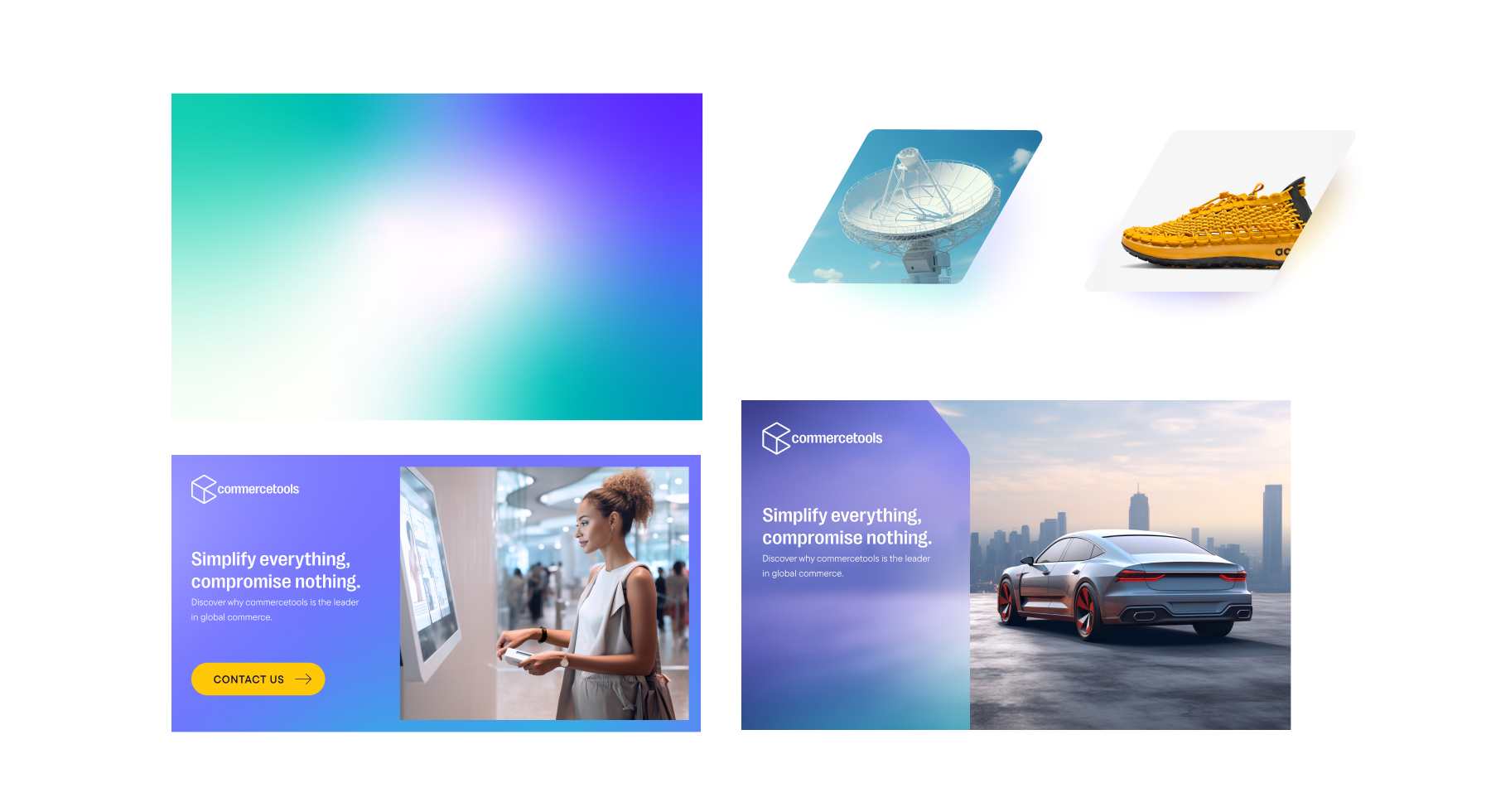
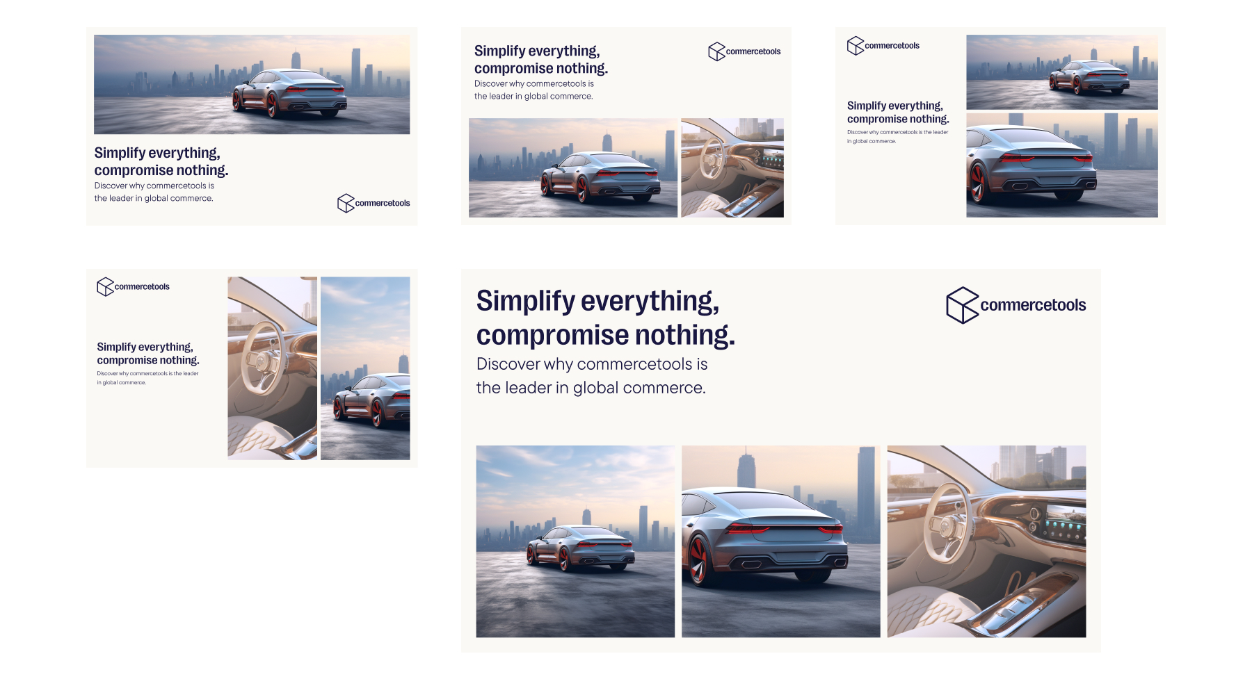
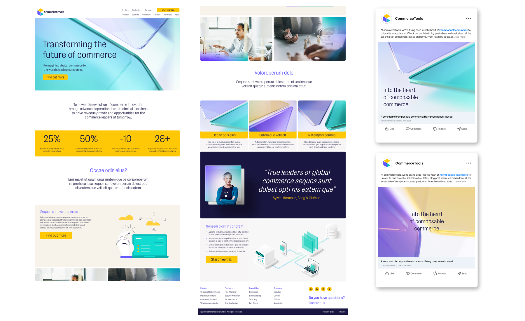
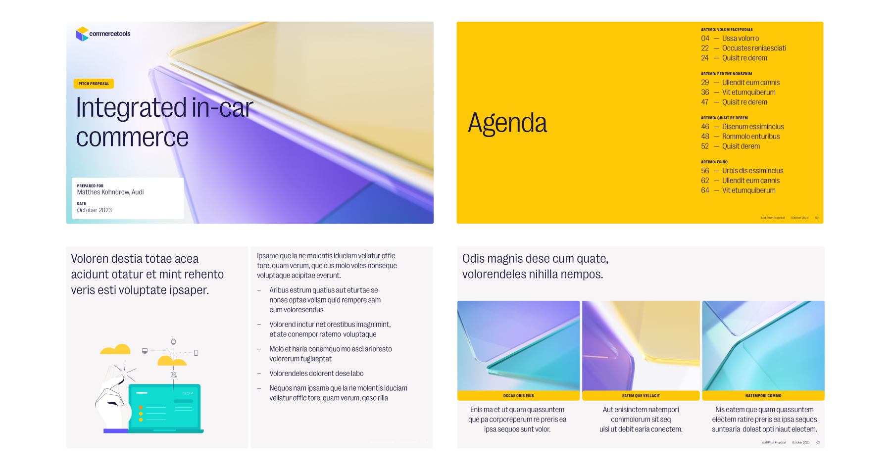
A key feature of our visual language are these 3D rendered glass panels, based on the shapes found in our symbol. They form a key part of our visual identity, and we use these assets for top-level brand imagery.
Taking the colours from our Symbol we also use gradients as part of our visual language. We can create subtle, glowing, drop-shadows behind imagery; or bring gradients into our flat glass effects - to be placed over photography, or to create interesting background textures. As seen in the examples below.
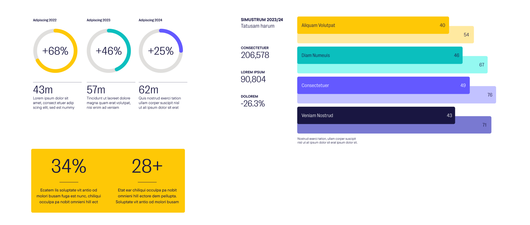
The goal with our info-graphics is to present information in a clear and visually engaging way. When creating info-graphics we mainly use colors from our Primary palette, supported by lighter and darker colours from the extended palette where necessary.
Typography in our info-graphics follows our typographic hierarchy, with the main information set in PP Right Grotesk, and supporting information set in TT Commons Pro.

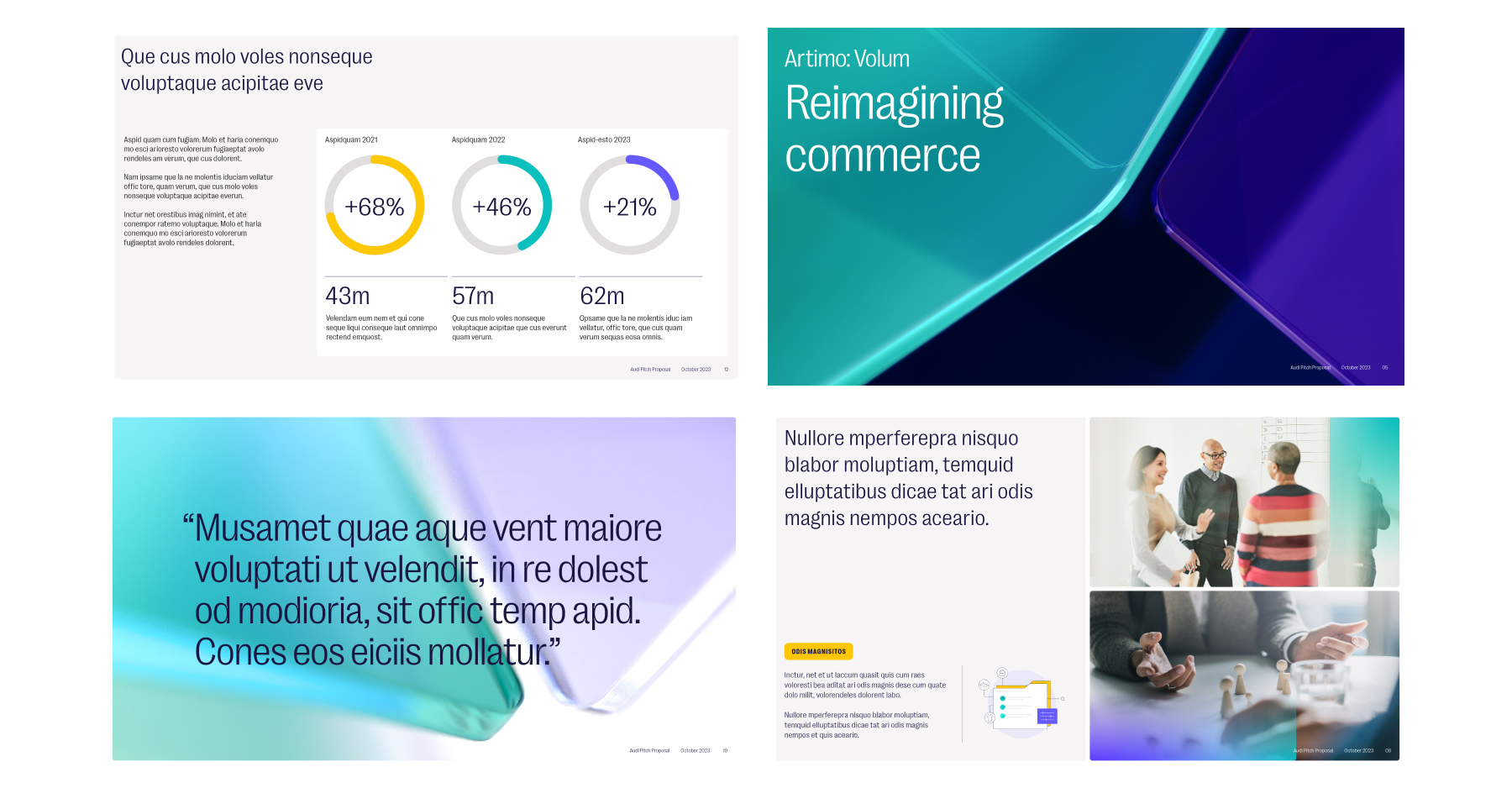
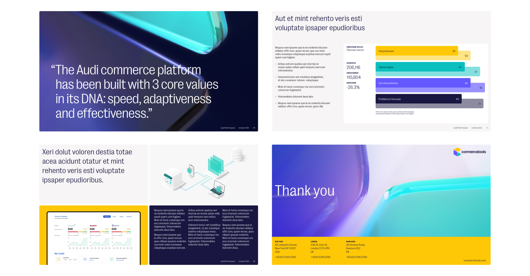
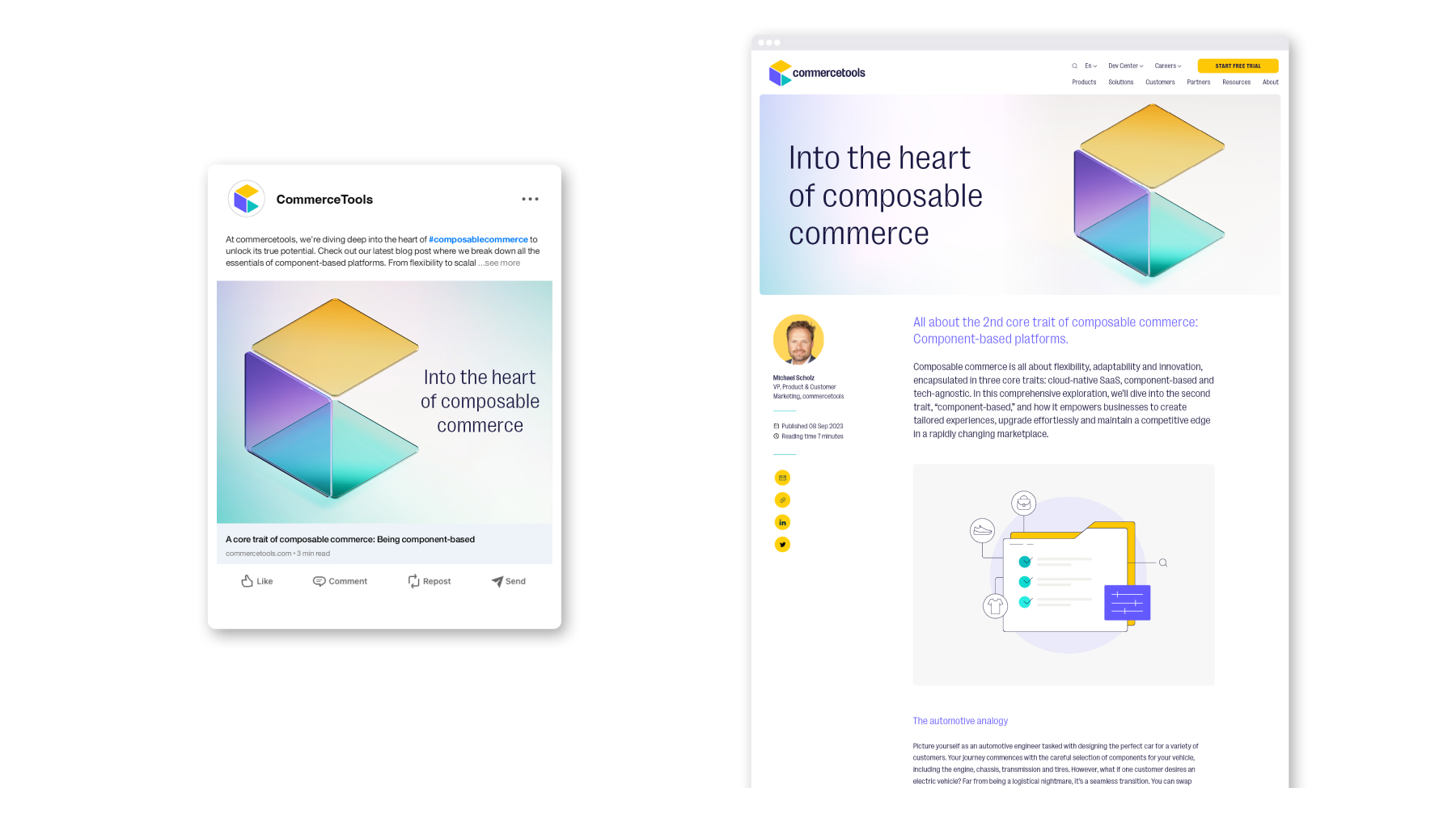

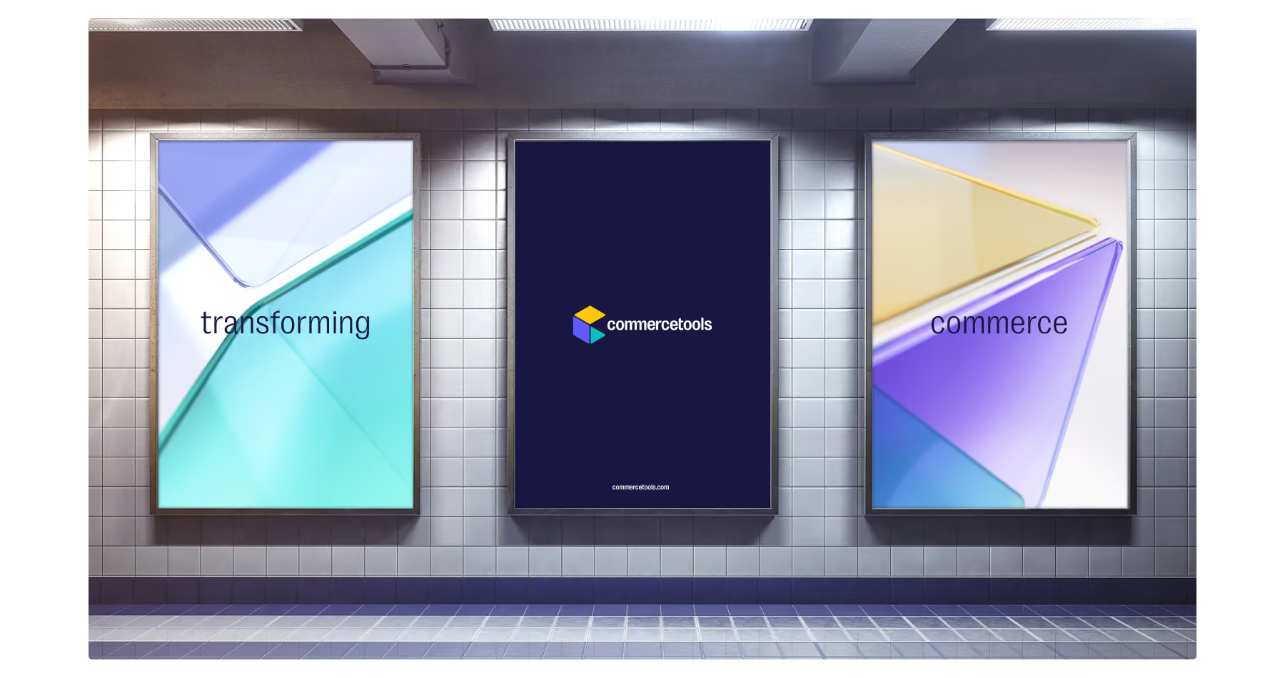

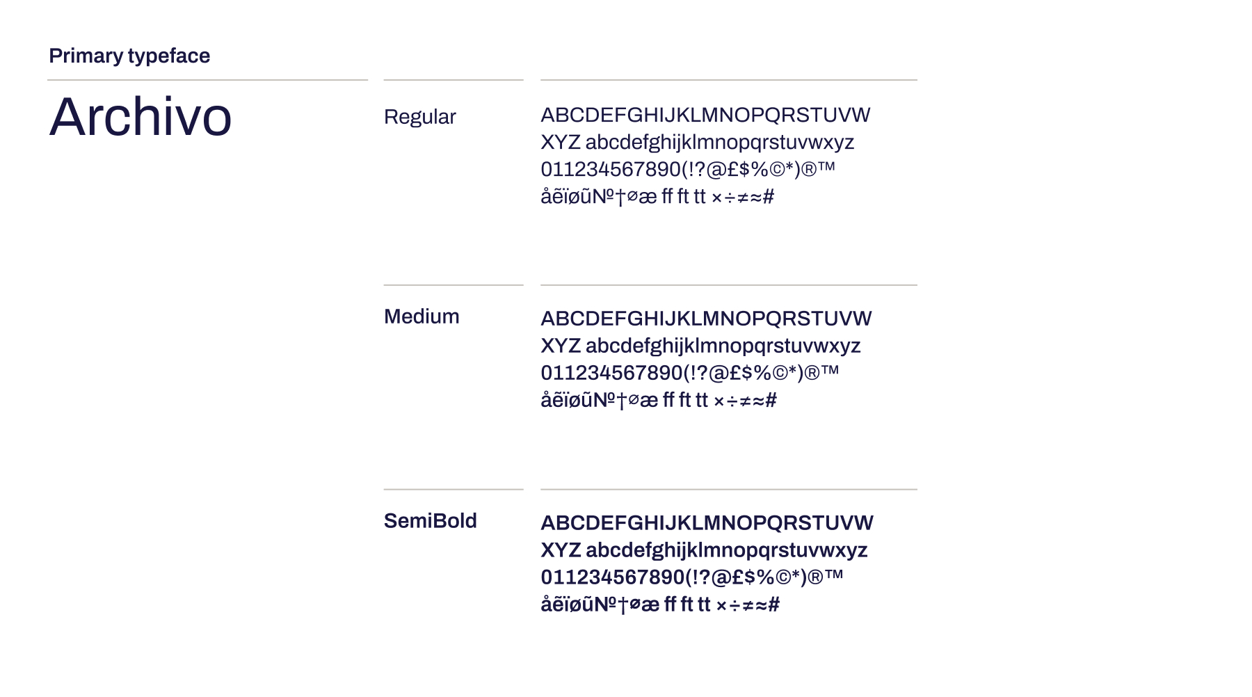
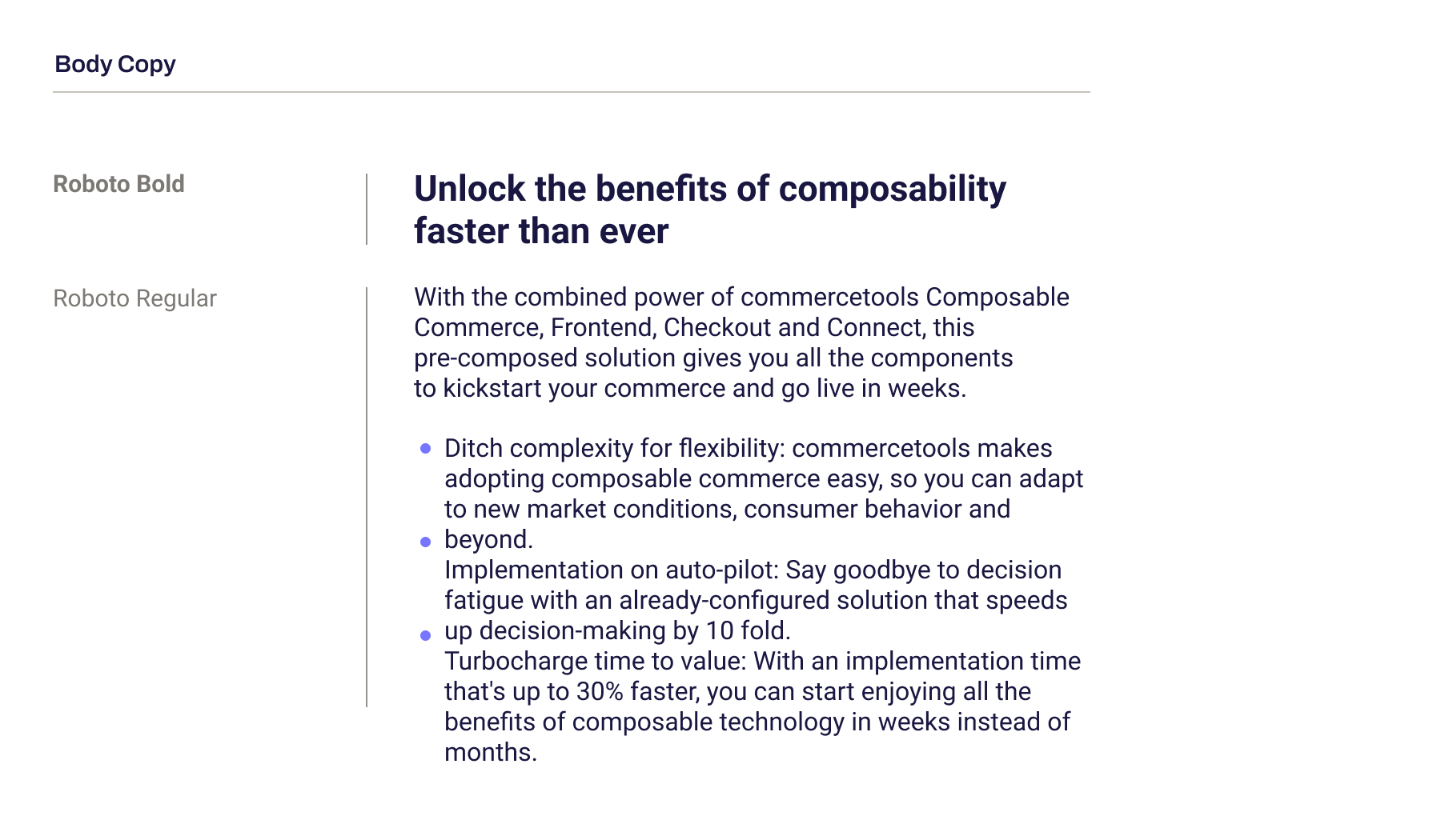
Our primary typeface is Archivo, which is used for headlines. The different weights allow us to create contrast and hierarchy.
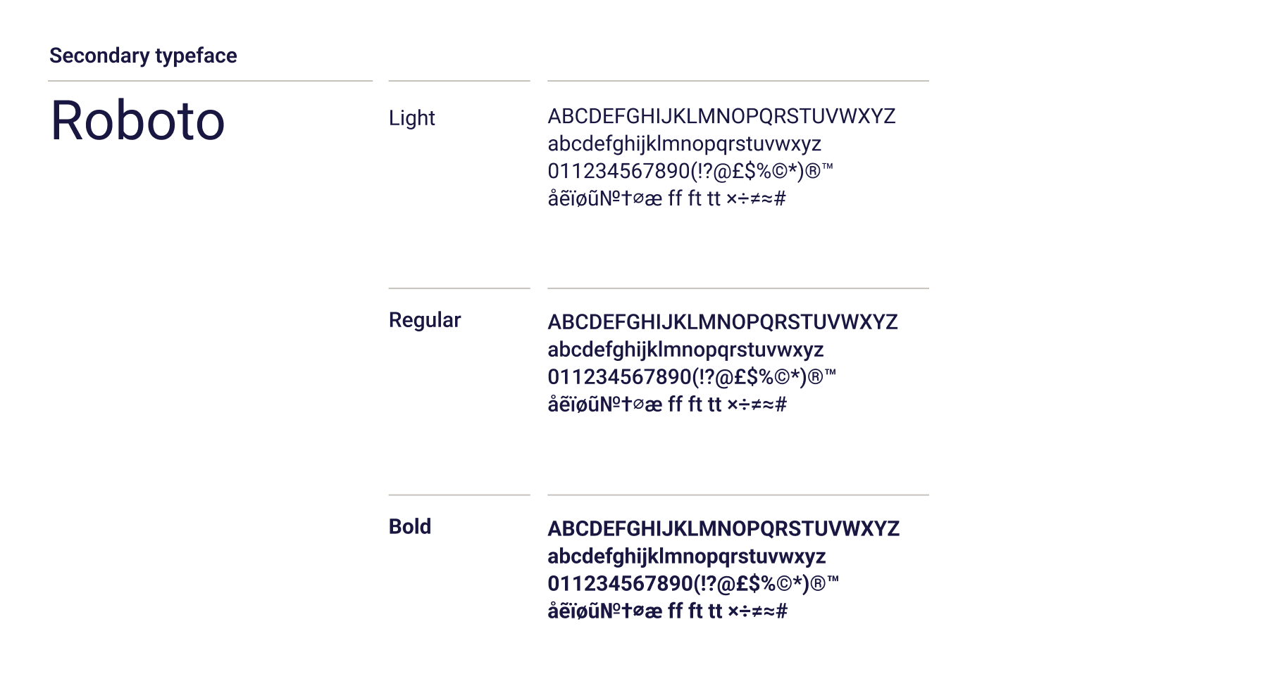
Our secondary typeface is Roboto, which is used for body copy.
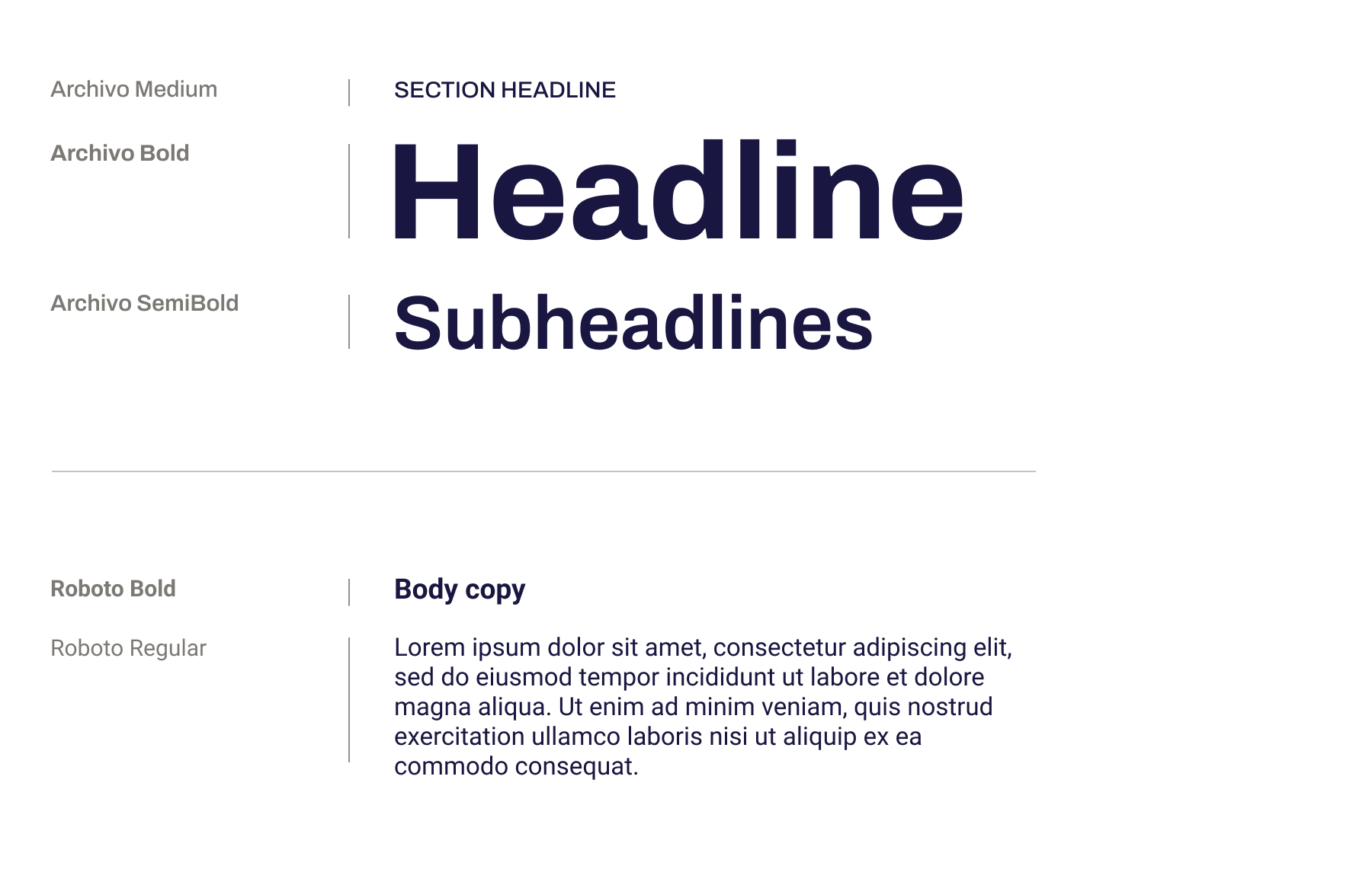
While the headline copy commands attention with its bold presence, the body copy assumes a supportive role.
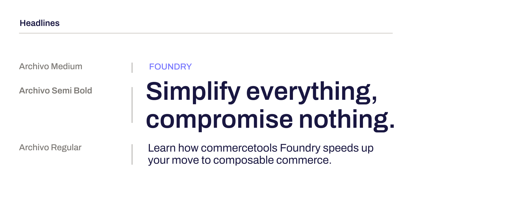
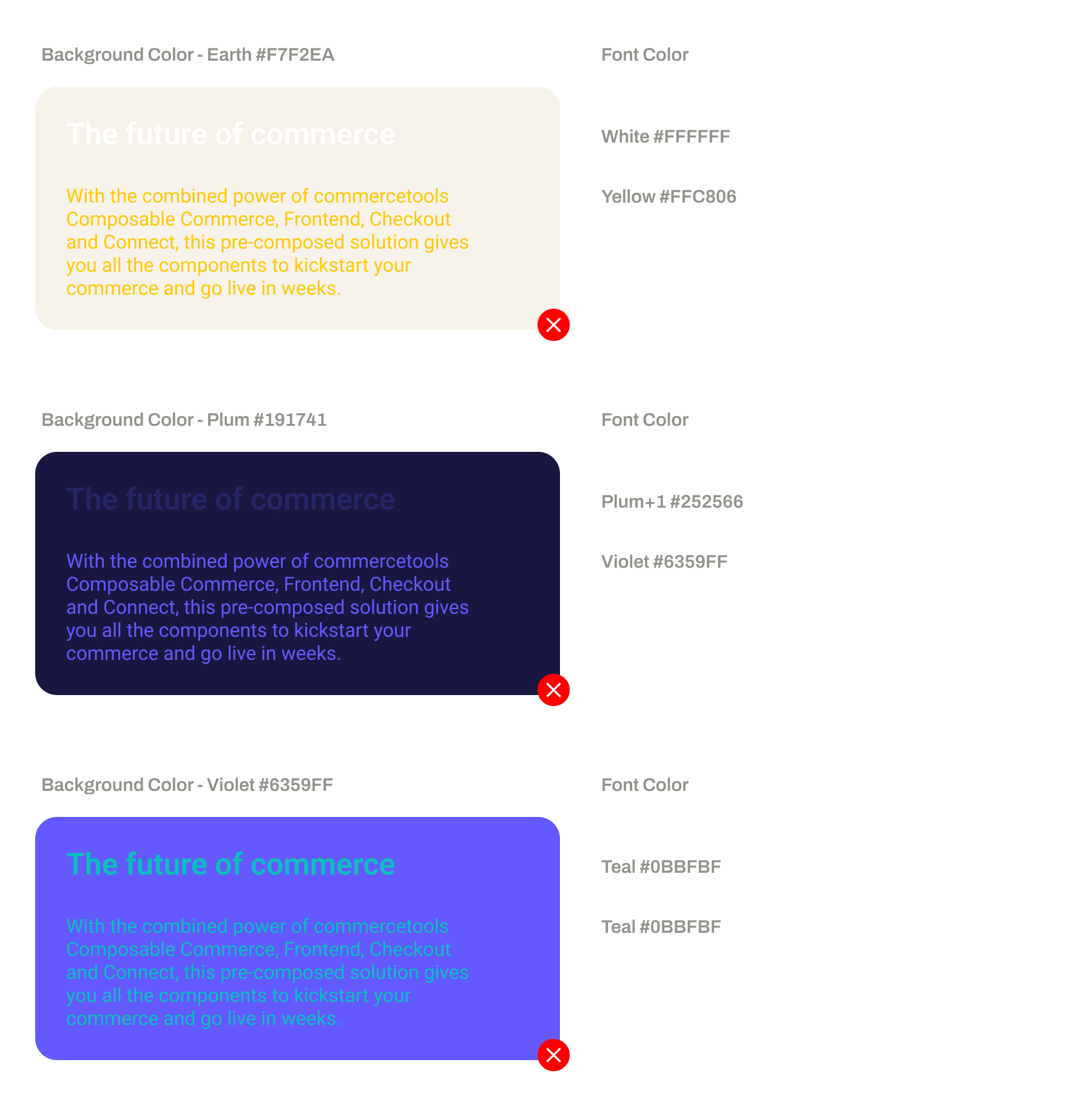
To ensure legibility, fonts and background colors should be chosen for maximum contrast.
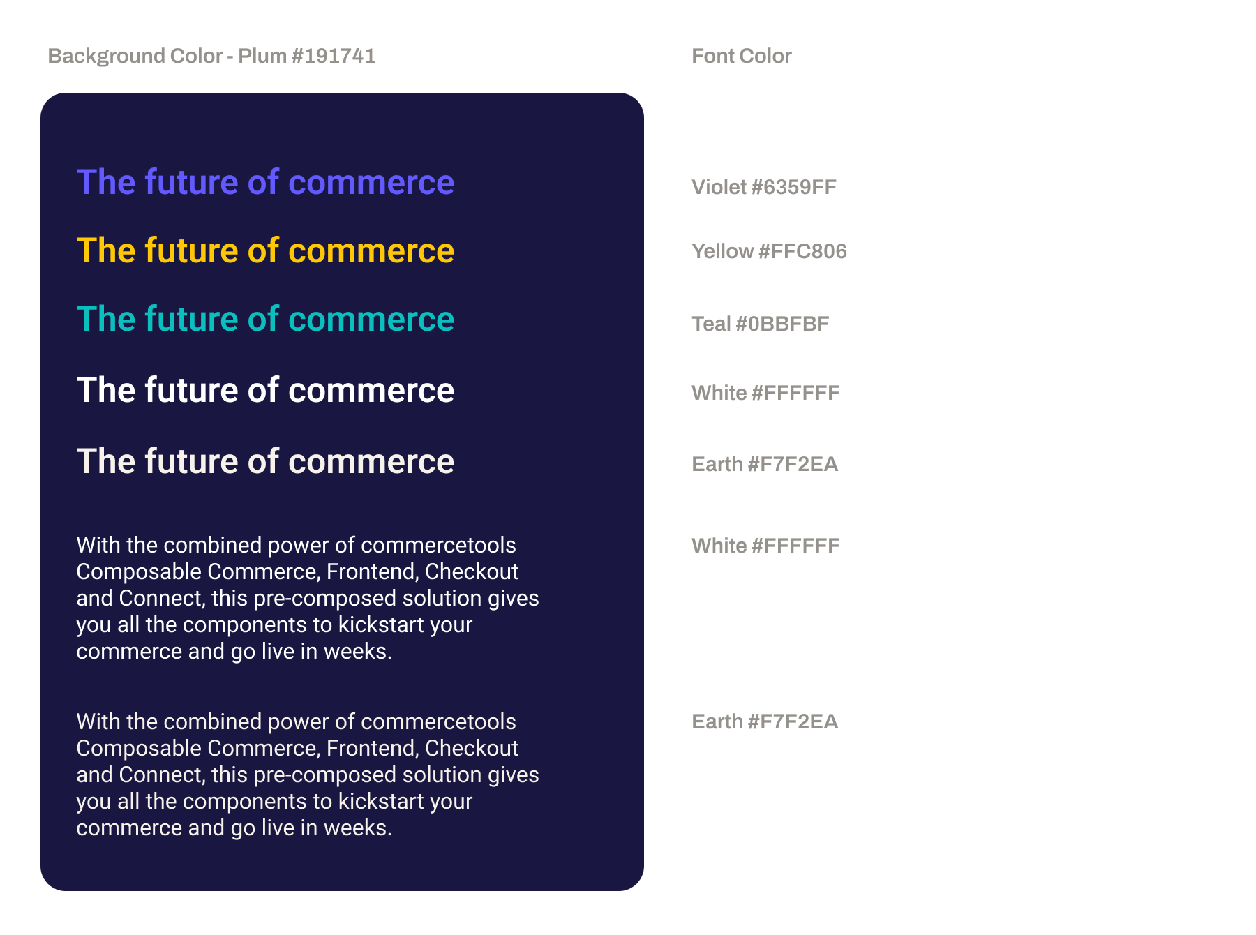
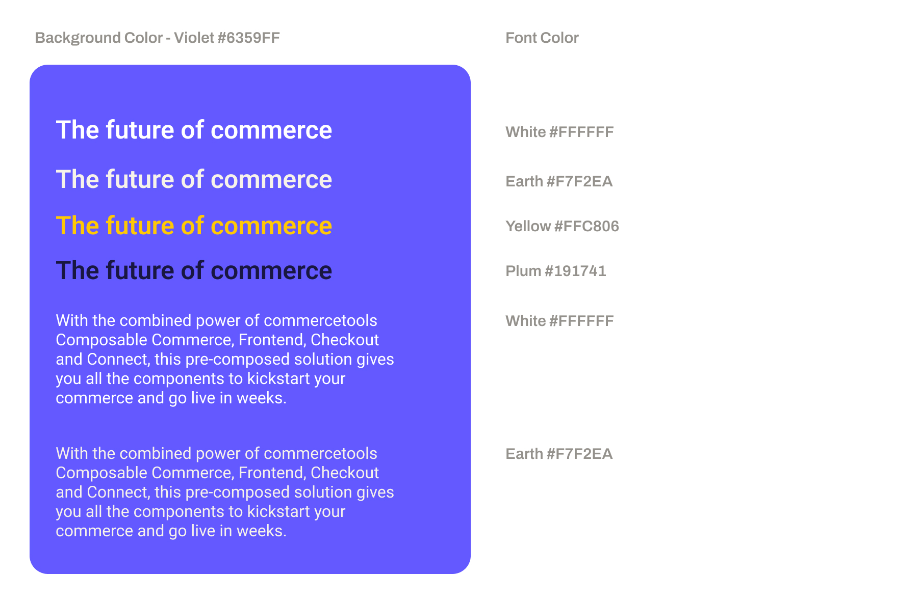
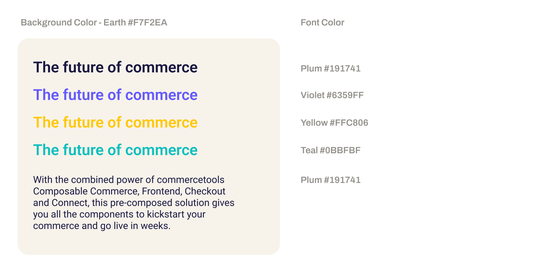
Please avoid combinations with low contrast or clashing colors.
Consistency matters most when commercetools appears alongside other brands. Whether you're creating joint materials, a news story or press release, or a customer story, the goal is to make sure that commercetools is presented clearly, confidently, and in line with our identity.
Use the full commercetools logo, never the icon alone
Match logo sizes to show equal partnership unless otherwise agreed
Maintain clear space around all logos
Avoid placing logos on clashing or low-contrast backgrounds
Use our boilerplate when describing commercetools
When space is limited, use the short descriptor: "commercetools is the leading enterprise commerce platform for innovation and versatility."
Do not alter the brand name (e.g., no camelCase, hyphens, or pluralization)
Refer to us as "commercetools" (lowercase, one word) in all content
Whenever you are writing about our company, keep in mind that:
commercetools is one word, spelled with a lowercase "c". Never a capital "C". Yes, even at the beginning of a sentence. Exception: In headlines written in capital letters, "COMMERCETOOLS" is also permitted.
We never break up our name
Avoid using apostrophes (commercetools')
commercetools is the name of the company, and thus our primary brand
commercetools is a portfolio company, offering a toolbox of best-of-breed solutions, such as a commercetools Composable Commerce
Event signage: logo and partner logos spaced evenly, with ample white space
Press release: include our approved boilerplate
Presentation slides: follow shared template for co-hosted content
Case studies: customer first, commercetools as the enabler behind the success
If you're unsure about an asset, we're happy to review it before publication.
For visual brand approvals, copy reviews, or questions about usage — Email: comms@commercetools.com
Thank you for helping us bring the commercetools brand to life consistently, creatively, and with purpose.
Reach out to our Design and Strategic Communications teams for approvals, asset requests, or usage questions.